Having a strong online presence is more than just looking good. It’s about creating responsive and user-friendly designs that engage users and drive sales. With a significant number of users leaving sites due to bad design and many clicks, it’s clear that a good interface is crucial. As more people use mobile devices, creating a design that works across all platforms is essential.
We know that first impressions matter a lot with 40% of people not giving second chances after a bad experience. This is why at Millennium Agency, we focus on making designs that are not only responsive but also optimized for SEO from the start. This ensures that your website meets users’ needs on any device.
Key Takeaways
- A robust online presence necessitates responsive and user-friendly software design, central to achieving business objectives.
- Improved user engagement is directly linked to intuitive design, which encompasses efficient navigation and rapid load times.
- Generous investments in user experience pay dividends in generating conversions, with well-designed sites fostering trust and credibility.
- A commitment to digital goals must include dedication to responsive design that adapts seamlessly across different devices.
- User testing and SEO are critical components of a strategy focused on establishing a solid online presence through design.
- Responsive design frameworks help create websites that are not only versatile but also foster enhanced user experiences.
Importance of Responsive Design in Software Development
Today, the adaptive design approach is key in software development. With technology growing and more devices on the market, developers need to create apps that work well everywhere. These apps should be easy to use on any device.
What is Responsive Design?
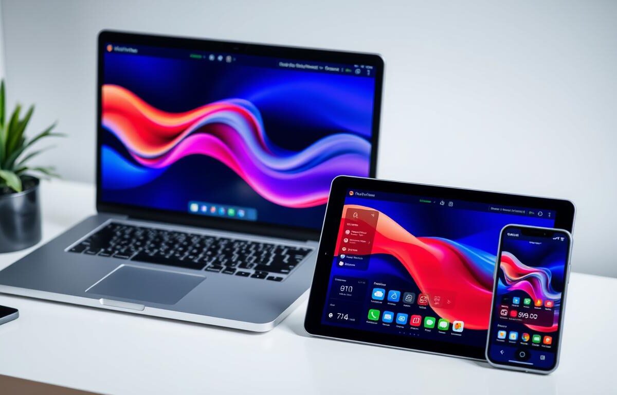
Responsive design means making websites and apps that adjust to any screen. It could be a desktop, tablet, or smartphone. This method offers a smooth experience for all users, no matter the device. Focusing on a mobile-friendly interface is smart. Today, most people use the internet on their phones.
Benefits of Responsive Design
- It reaches more users, especially the growing number on mobile.
- Improves how users feel about the site, keeping them there longer.
- Makes developing and updating simpler since you don’t need different versions for each device.
- Helps your site rank better in Google searches, as Google likes sites that work well on mobile.
Common Challenges in Responsive Design
Making responsive designs comes with hurdles. Designers and developers must think about screen sizes, how people interact with their devices, and keeping sites fast. They often need to get creative to solve these problems. This ensures the design works well for everyone.
| Aspect | Impact on Responsive Design |
|---|---|
| Global Increase in Mobile Usage | Requires a focus on mobile-first strategies |
| Google’s Mobile-Friendly Algorithm | Promotes designs that are easy to use on mobile |
| User Experience on Mobile Devices | Demands simple navigation to keep users happy |
| Cost Reduction | Using one adaptable design saves money on development and upkeep |
| SEO Benefits | Responsive sites get higher spots in search results |
Responsive design is essential in today’s web development. It combines adaptive design approach and user-responsive software development. This ensures all users have great experiences across any platform.
Key Principles of User-Friendly Software Design
In today’s digital era, making software that meets users’ needs is key. It’s not just about looking good. It’s about making software easy and efficient to use. By focusing on user-centric design, we make sure our software is easy for everyone.

User-Centered Design Approach
A user-centered design is essential for great software. It means listening to users at every step. By doing this, we make software that people find easy to use and enjoy. This leads to happier users and more success for the software.
Accessibility in Software Design
Accessibility is vital in making software user-friendly. It lets people of all abilities use our products easily. This inclusivity makes the software better for everyone, not just those with special needs.
| Metric | Impact of User-Centric Design |
|---|---|
| Customer Satisfaction Increase | 32% |
| Revenue Growth | 21% |
| Rate of Successful Product Launch | 50% |
| Improvement in Usability | 41% |
| Reduction in Development Time | 24% |
| User Preference for Intuitive Navigation | 79% |
Designers do more than create good-looking interfaces. They design for ease of use and intuitive function. By embracing user-centric design, they make products that everyone can use and love.
Tools and Technologies for Responsive Design
To excel in creating responsive software, designers need the right tools. The shift towards mobile use makes this critical. Tools that improve flexibility and user interaction are key.
Leading Frameworks for Responsive Development
Bootstrap and other frameworks are crucial for responsive web design. They offer components and utilities for a user-friendly design. Bootstrap provides a grid system and adaptable components for any screen size.
Popular Design Tools
Figma and Adobe XD lead in design tools because they support collaboration and are cloud-based. They help create responsive designs that adjust across devices. This ensures a uniform user experience everywhere.
These tools make responsive typography and flexible images easy. They help designs fit on various devices without issues.
| Tool | Features | Usage Percentage |
|---|---|---|
| Bootstrap | Grid system, responsive components | 75% |
| Figma | Collaborative, real-time editing | 63% |
| Adobe XD | Prototyping, voice design | 58% |
| Webflow | Visual CMS, animations | 45% |
| InVision Studio | Interactive prototyping, real-time collaboration | 40% |
| Sketch | Vector UI design, symbolic references | 85% |
This table shows the popularity of tools with features that make software design responsive and user-friendly. These tools meet the needs for responsive sites due to mobile traffic, at 65.47% as of May 2023.
Using these advanced tools and technologies, developers can face the varying device and screen sizes head-on. This approach ensures software not only adapts but also remains engaging for users.
Best Practices for Responsive User Interfaces
Technology keeps changing. This means responsive and user-friendly software design is crucial. By learning how fluid grid systems and adaptive images work with CSS media queries, creators can make websites more welcoming and easy to use.
Fluid Grids and Flexible Images
A fluid grid system helps create a website that changes smoothly across different screens. This way, elements on a page stretch or shrink together. For images, using adaptive images makes sure they always look good and load fast, no matter the device.

- 94% of smartphone users in the USA search for local info on their devices.
- Responsive designs usually have at least three breakpoints for various devices, sometimes five for the best flexibility.
- Using a minimal design can make websites load faster and improve how users feel about the site.
Media Queries in CSS
Media queries are key to responsive web design. They let CSS change styling based on device features like width and orientation. This change is important for keeping the website consistent on different devices. With media queries, it’s easier to make clickable areas bigger, which makes the site easier to use on various devices.
To wrap up, adopting these responsive design practices is not just about following trends. It’s about creating sites that users will enjoy and engage with more. As technology moves forward, regularly updating and refining these practices will keep responsive design effective.
Evaluating and Testing User-Friendliness
For a software app to be easy to use, it’s crucial to test it with real people. This lets companies find and fix problems early. By doing so, they create a more engaging experience for users. We’ll look into how to test effectively and the importance of ongoing feedback.
Methods for User Testing
Understanding and using the right testing methods is key to making software user-friendly. These methods highlight issues, show where improvements can be made, and provide insights into user behavior. Techniques include surveys, watching users in real-time, and getting direct feedback. For more info, you can check out these examples.
Importance of Feedback and Iteration
Iterative design is vital for user-friendly software. It involves repeating cycles of designing, testing, analyzing, and refining. Feedback from users is incredibly important in this process. It shows how design changes affect their satisfaction and efficiency. Regular testing and feedback after launching can make the software even better over time.
| Parameter | Description | Impact on User Experience |
|---|---|---|
| Learnability | How easy it is for new users to accomplish tasks the first time they encounter the design. | User can quickly become productive. |
| Memorability | When returning to the design after a period of not using it, how easily can the user reestablish proficiency? | Enhances user’s ability to engage with software. |
| Efficiency | The speed at which tasks can be completed after learning the design. | Users perform tasks more swiftly, boosting productivity. |
| Satisfaction | How pleasant is it to use the design? | Improves retention rates and user recommendations. |
| Errors | How many errors do users make, how severe are these errors, and how easily can they recover from the errors? | Minimizes frustration and enhances overall user satisfaction. |
Creating a user-friendly interface requires careful planning, regular testing, and listening to user feedback. By focusing on usability and iterative design, developers can exceed user expectations. This ensures a more engaging and efficient experience for users.
Understanding the User Journey
Understanding the user journey deeply is key to great software. It involves tracking every step a user takes, from first contact through ongoing interaction. This helps in making software that doesn’t just meet, but beats, user expectations.
Mapping User Interactions
Mapping user interactions highlights key steps like website visits and social media activity. It gives insights for improving the interactive user experience. This is vital for top-notch user experience expertise.
- Customer Emotions: Understanding the emotional impact at each stage.
- Moments of Truth: Identifying and optimizing key interactions.
- Continuous Analysis: Leveraging data to refine touchpoints.
This approach ensures every touchpoint makes the user journey better.
Creating User Persona Profiles
Creating detailed user persona profiles is crucial. They help in personalizing the user experience by understanding users’ demographics, behaviors, and needs.
Persona profiles summarize key user information, aiding in making apps that not only work well but also connect on an emotional level.
- Marketing Automation: Tailoring messages and interactions to individual user preferences.
- Cultural Inclusivity: Ensuring the design respects and reflects diverse user backgrounds.
- Empathy and Inclusivity: Creating designs that consider all user demographics, enhancing accessibility and satisfaction.
These steps improve how well we understand and meet user needs, making experiences more personal and effective.
By focusing on the details of the user journey and creating strong interactive user experience strategies, companies can make their software stand out. This ensures they go beyond what users expect.
The Role of Typography in User-Friendly Design
Typography plays a big role in making designs user-friendly. It’s not just about picking fonts. It involves using type effectively for clear communication and visual appeal. This is super important in digital spaces. Here, responsive typography and scalable fonts are key.
Best Fonts for Readability
Picking easy-to-read fonts is essential for good typography. The right fonts make reading smoother and help users understand your content better. Font size, spacing, and line height are critical. They help make sure your text works well on any device. Studies show that 47% of decisions in web typography aim to boost readability. So, choosing clear fonts is a must.
Font Sizes and Scalability
Fonts need to adapt to different screens and resolutions. This keeps text clear and pleasing to the eye no matter the device. 55% of experts stress on using responsive typography. It keeps your text legible and aesthetically pleasing across all devices. Scalable fonts change size automatically, keeping text accessible everywhere.
Experts also recommend keeping your typography consistent. 92% agree this makes your website look cohesive. A unified style improves how users interact with your site.
| Typography Factor | Importance for User-Friendly Design | Percentage of Experts in Agreement |
|---|---|---|
| Consistency in Typography | Establishes cohesive visual experience | 92% |
| Responsive Typography | Ensures legibility on various devices | 55% |
| Scalable Fonts | Adapts text size based on device | Essential |
| Readability Focus | Enhances user engagement and comprehension | 47% |
Combining font legibility, responsive typography, and scalable fonts is crucial. It’s about more than looking good. It’s about making a site accessible and enjoyable for all. By integrating these elements, typography meets the needs of today’s web design.
Future Trends in Responsive and User-Friendly Software Design
As 2025 approaches, software design is evolving rapidly. It’s shaped a lot by AI in software design and emerging design technology. We’re seeing interfaces that are more adaptive and user-friendly. These interfaces use AI and machine learning to offer personalized experiences. Future software will not just function well but also connect emotionally, using colors that bring peace and warmth.
The Impact of AI and Machine Learning
AI and machine learning are changing how we see responsiveness in software. They create interfaces that adapt to user habits and preferences. With these technologies, software can offer precise suggestions, simplify tasks, and even foresee needs. This way, software isn’t just functional—it deeply understands users.
Emerging Design Frameworks and Practices
New design frameworks are emerging next to AI. Trends now lean towards minimal yet bold visuals, like big typography and brutalism. There is also a move towards designs that don’t harm our planet. This includes using eco-friendly hosting and making thoughtful design decisions.
Additionally, designs are becoming more interactive and intuitive. This makes for a more engaging and informative user journey. The rise of voice user interface (VUI) technology means future designs will go beyond the screen. We can look forward to software that supports hands-free use in many fields. The push in software design reflects not just tech progress but also a deeper commitment to beauty and user understanding.
FAQ
What is responsive and user-friendly software design?
Responsive and user-friendly software design makes software easy to use. It works well across different devices and screen sizes. This design aims to keep users engaged and meet digital goals while building a strong online presence.
What is Responsive Design?
Responsive design creates a mobile-friendly interface. It adjusts content layout based on the device’s screen size and orientation. Making sure applications look and work great on any platform is key.
What are the benefits of Responsive Design?
The benefits include easier access for all, a uniform user experience, reaching more mobile or tablet users, better search engine spots, and savings by maintaining one site for all devices.
What are common challenges in Responsive Design?
Challenges include making sure design and content fit all screen sizes, quick load times on every device, easy use whether touching or clicking, and keeping design beautiful and functional on all platforms.
What does a user-centered design approach entail?
It means focusing on what users need and want right from the start. This approach uses user feedback, tests for ease of use, and designs that just make sense, improving software usage and the experience overall.
How is accessibility integrated into software design?
Accessibility means making software easy for everyone to navigate and use. It follows guidelines like adding text for images, ensuring visuals are clear, making everything keyboard-friendly, and providing options for different disabilities.
Which frameworks are leading for responsive development?
Bootstrap and Foundation are top frameworks for developing responsive designs. They offer ready-made components and grid systems to efficiently create designs that react well to user actions and enhance experiences.
What are some popular design tools used for responsive design?
Tools like Adobe XD, Sketch, Figma, and InVision are favored for responsive design. They allow designers to build adaptable layouts, test interactions, and work together with teams in real-time.
How do fluid grids and flexible images contribute to responsive design?
Fluid grids use relative units to adjust layout to different screens. Flexible images scale within their containers, preventing overflow and keeping designs consistent across devices.
What is the purpose of using media queries in CSS?
Media queries in CSS help apply different styles based on device attributes like size and orientation. They’re crucial for adjusting layouts to fit breakpoints, making sites and apps responsive and user-friendly.
What methods are most effective for user testing?
Effective user testing methods include A/B testing, usability studies, interviews, surveys, eye-tracking, and expert reviews. These tactics reveal user behavior and preferences, guiding usability enhancements.
Why is feedback and iteration important in design?
Feedback and iteration enhance design by adapting based on user input. Continuous refinement helps meet user needs more effectively, improving the interactive experience.
How is user interaction mapping beneficial?
Interaction mapping visually tracks user paths through software, pinpointing difficulties. This data drives decisions to smooth user flow and simplify interactions.
What are user persona profiles and why are they important?
User persona profiles represent potential users of a site or product. They help designers understand user expectations, behaviors, and needs, leading to designs that are more focused on users and easy to use.
What makes a font ideal for readability?
A good font for reading is clear, easy to see, and comfortable in various sizes and devices. Choosing well-designed typefaces with suitable spacing, height, and weight ensures readability under different conditions.
Why is font size and scalability important in responsive design?
Right font size and scalability make text easy to read on any device or screen size. Scalable fonts adjust to screen resolution and size, ensuring a consistent and accessible reading experience.
How will AI and Machine Learning affect future software design?
AI and Machine Learning will transform software design by offering tailored user experiences. These technologies will predict user needs, automate tasks, and foster intuitive interactions, leading to smarter, more responsive designs.
What emerging design frameworks and practices should designers be aware of?
Designers should watch for new frameworks and trends like CSS Grid, Progressive Web Apps, motion UI, and microinteractions. Keeping up with these developments helps create compelling, forward-looking digital experiences.