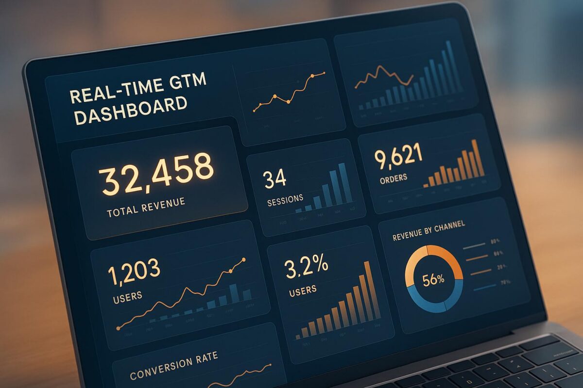
Real-time GTM dashboards give your team instant access to up-to-date data across sales, marketing, and customer systems. Unlike static reports, these dashboards integrate tools like Salesforce, HubSpot, and Google Analytics to provide live metrics that update within seconds. This allows teams to react quickly to stalled deals, declining conversion rates, or customer issues – saving time and improving decision-making.
Key features include:
- Data integration: Combines platforms like CRMs, marketing tools, and analytics systems.
- Real-time updates: Reflects changes immediately, such as prospect activity or sales progress.
- Actionable insights: Highlights pipeline bottlenecks, lead scores, and churn risks.
- Automated workflows: Triggers tasks, alerts, and follow-ups based on live data.
Tools like PowerBI, Google Looker, and n8n power these dashboards, while companies like SixtySixTen specialize in creating tailored solutions for B2B SaaS teams. By unifying data and automating actions, these dashboards free up your team to focus on growth.
How to Combine Data from Multiple GTM Systems
Where GTM Data Comes From
GTM data comes from a variety of platforms, each playing a unique role in the revenue process. For example, CRM systems like Salesforce and HubSpot store essential details such as contact information, deal stages, and sales activities. Meanwhile, marketing automation platforms like Marketo, Pardot, and Mailchimp track email campaigns, lead scoring, and nurture sequences.
On the product side, analytics tools like Mixpanel, Amplitude, and Google Analytics focus on user behavior, feature adoption, and conversion funnels. Sales enablement platforms such as Outreach, SalesLoft, and Apollo handle prospecting sequences and call activities, while customer support systems like Zendesk and Intercom provide insights into ticket volumes and customer satisfaction. Lastly, ad platforms like Google Ads, LinkedIn Ads, and Facebook Ads generate data on campaign spending and lead generation.
To put it into perspective, a single prospect might interact with your business through multiple touchpoints: clicking on a Google Ad, visiting your website, downloading a whitepaper, receiving nurture emails, and participating in sales calls logged in a CRM. With data scattered across so many systems, integrating it all requires effective tools.
Tools for Connecting Data Sources
Bringing together data from these platforms calls for integration tools that can bridge the gaps. Modern GTM teams often rely on integration platforms to connect these systems seamlessly. For instance, Make.com offers a library of over 3,000 pre-built applications for setting up workflows quickly, plus an API for custom integrations. This means most GTM tools already have plug-and-play connections available.
Another powerful tool, Clay.com, focuses on enriching GTM data by connecting with over 150 premium data providers. It integrates directly with existing GTM systems, streamlining data enrichment processes.
For teams with unique workflows, n8n provides a more customizable solution. Unlike standard plug-and-play platforms, n8n allows GTM teams to build advanced data pipelines tailored to specific business needs. This is especially useful for handling complex data transformations or non-standard formats.
When it comes to visualizing the integrated data, tools like Google Looker and PowerBI step in. These platforms take the cleaned, unified data and transform it into real-time dashboards with charts, graphs, and alerts. However, even with these tools in place, ensuring data consistency and synchronization is critical.
Common Data Problems and How to Fix Them
Integrating data from multiple systems often comes with challenges, but understanding these issues and how to address them can make a big difference.
- Data formatting inconsistencies are a common headache. For instance, your CRM might store phone numbers as "(555) 123-4567", while your marketing platform uses "555-123-4567", and your sales tools record "+1 555 123 4567." Integration platforms can apply normalization rules to standardize these formats before merging the data.
- API rate limits can slow down real-time data flows when pulling from multiple sources. Clay offers a solution by efficiently managing API calls while monitoring buying signals from over 3 million companies. Its infrastructure ensures smooth operation while staying within rate limits.
- Duplicate records are another frequent issue, especially when the same prospect exists in multiple systems with slight variations in their details. Fuzzy matching algorithms can identify duplicates based on similarity scores rather than exact matches. For example, "John Smith" at "ABC Corp" and "Jon Smith" at "ABC Corporation" would be flagged for review.
- Missing data fields can leave gaps in prospect profiles when different systems capture different details. Clay helped Anthropic save 4 hours a week by automating lead enrichment and scoring in Salesforce, filling in missing data automatically. This ensures dashboards display complete and accurate profiles.
- Real-time synchronization delays can result in outdated dashboards. SixtySixTen addresses this by using webhook-based triggers that push updates immediately. For example, if a prospect visits a pricing page or opens an email, this activity is reflected on the dashboard within seconds rather than hours.
How Real-Time Dashboards Replace Spreadsheet Chaos
Tracking and Displaying GTM Metrics
By leveraging unified data flows, dashboards turn raw data into actionable insights that drive decision-making.
Important Metrics for GTM Teams
Real-time GTM dashboards highlight metrics that emphasize revenue growth and operational efficiency. One key metric is pipeline velocity, which measures how quickly deals move through your sales process. This is calculated as the average time from initial contact to a closed-won deal. Identifying delays here can help you address bottlenecks and improve revenue forecasts.
Conversion rates are another critical focus, showing where prospects drop off in your funnel. For example, tracking the conversion rate from marketing qualified leads (MQLs) to sales qualified leads (SQLs) can reveal the quality of your leads. Similarly, monitoring the demo-to-proposal conversion rate helps gauge how effectively prospects are progressing through the sales cycle.
Metrics like Annual Recurring Revenue (ARR) and Monthly Recurring Revenue (MRR) are essential for tracking SaaS growth. Breaking these down by customer, channel, or product can pinpoint what drives growth. Real-time dashboards provide immediate updates as deals close, giving teams a live view of revenue changes.
Lead response time plays a crucial role in conversions. Dashboards can monitor the average time it takes to respond to leads and show the percentage of leads contacted within the desired timeframe.
Metrics like Customer Acquisition Cost (CAC) and Customer Lifetime Value (LTV) ratios provide insight into the sustainability of your growth strategies. Real-time tracking of these ratios helps teams make quick adjustments to marketing budgets or sales priorities when needed.
How to Design Clear Dashboard Views
A well-designed dashboard makes it easy to focus on what matters most. Start by placing revenue metrics – like current ARR, MRR growth rates, and pipeline value – at the top. Use bold, large figures to make these numbers stand out. Incorporate color coding to highlight performance: green for exceeding targets, yellow for metrics nearing thresholds, and red for areas that need attention.
The right chart types can make data easier to understand. Use line charts to show trends over time, like monthly lead generation or pipeline growth. Bar charts work well for comparing performance across channels, teams, or time periods. For metrics with specific targets, like lead response times, gauge charts offer quick, visual feedback.
Dashboards can also include alerts to notify teams when key metrics fall outside acceptable ranges. For instance, if lead response times exceed the desired threshold, the dashboard can trigger a notification. Similarly, a drop in pipeline velocity compared to historical averages can prompt teams to investigate potential issues.
The layout of a dashboard should follow a logical flow that matches team priorities. Sales managers might prefer starting with an overview of team performance before diving into individual metrics, while marketing teams may focus first on lead generation and then on conversion rates and attribution.
Filtering options are essential for tailoring dashboards to specific needs. For example, sales reps might filter data to view only their accounts and opportunities, while executives might require a company-wide overview with the ability to segment by region, product line, or customer size.
Lastly, standardizing how data is presented across dashboards ensures clarity and consistency.
U.S. Formatting Standards for Dashboards
Consistent formatting helps everyone interpret data accurately and avoids confusion during meetings or reports. For currency values, always display the dollar sign before the number (e.g., $125,000), using commas as thousand separators. Abbreviations like $1.2M for $1,200,000 or $125K for $125,000 can simplify large figures, as long as you’re consistent.
Dates should follow the MM/DD/YYYY format commonly used in the U.S. For instance, January 15, 2024, would appear as 01/15/2024 in data tables or 1/15/2024 in more casual settings. Time stamps should use a 12-hour format with AM/PM indicators (e.g., 2:30 PM).
For percentages, include the percent symbol (%) immediately after the number, with one decimal place for precision (e.g., 23.7%), unless greater detail is necessary.
When displaying numbers, use commas as thousand separators (e.g., 1,250 leads) and periods as decimal points (e.g., 4.5 average deal size). Abbreviate large numbers consistently, using K for thousands (e.g., 1.2K leads) and M for millions (e.g., 2.3M page views).
Tools like PowerBI and Google Looker offer built-in options to apply these formatting standards automatically when the locale is set to the U.S. For custom dashboards created with platforms like n8n, manual configuration may be required to ensure consistency across all metrics displayed.
sbb-itb-647c22e
Converting Metrics into Actions
Taking the unified data streams we discussed earlier, the next step is turning these metrics into actions that drive success in go-to-market (GTM) strategies. Real-time dashboards play a key role here, translating data patterns into actionable steps that teams can implement instantly to enhance performance.
How Dashboards Turn Data into Actionable Items
Dashboards don’t just display data – they analyze patterns to flag opportunities and problems that need attention. For example, if pipeline velocity drops below historical averages, dashboards can pinpoint stagnant deals. They then generate tasks like scheduling follow-up calls or reviewing proposals to re-energize those deals. Similarly, deals that linger beyond typical cycle times are flagged, creating chances to speed things up.
When it comes to lead scoring, dashboards combine multiple data points, such as visits to pricing pages, case study downloads, and alignment with ideal customer profiles. This process assigns priority scores to high-intent leads and automatically alerts sales reps to act immediately.
Dashboards also make churn prevention proactive. By monitoring customer health scores, they detect early warning signs like declining metrics. This triggers tasks for customer success teams, such as scheduling check-ins or escalating issues to account managers. On the revenue side, dashboards track deal progress and suggest focusing efforts on high-probability opportunities, making forecasting more precise.
These insights naturally integrate into automated workflows, ensuring that necessary actions are executed without delay.
Using Automated Workflows to Act on Dashboard Insights
AI-powered workflows take dashboard insights and transform them into immediate actions, cutting out manual steps. When specific triggers occur, workflows update systems, reassign leads, and notify the right stakeholders.
For instance, task automation ensures no high-value lead falls through the cracks. If a prospect hasn’t been contacted within two hours, the system creates CRM tasks, sends Slack notifications, and even drafts follow-up emails automatically.
Tools like n8n and Make.com connect dashboard data across multiple platforms. When deals hit certain stages, workflows can update CRMs, notify implementation teams, generate contracts, and schedule onboarding calls – all in real time.
AI agents take it a step further by analyzing dashboard data to make smart decisions about resource allocation. For example, they can adjust ad spend, pausing underperforming campaigns while funneling more budget into high-performing ones. If monthly recurring revenue dips below targets, automated workflows send alerts to stakeholders along with specific recommendations for corrective action.
With these workflows in place, GTM teams can seamlessly integrate insights into their daily routines.
Putting Insights to Work for GTM Teams
For sales teams, dashboard insights help optimize daily activities by focusing on the most impactful opportunities. For instance, if dashboards reveal that certain industries have higher conversion rates, sales reps can prioritize those prospects and tweak their messaging accordingly.
Marketing teams benefit from real-time campaign optimization. By monitoring metrics, they can quickly amplify high-performing content while pausing campaigns that aren’t delivering results, ensuring a better return on investment and improved lead quality.
Resource allocation also becomes more strategic. Dashboards highlight performance trends across team members or territories, allowing customer success teams to intervene early when usage drops or support tickets spike. This data-driven approach ensures retention risks are addressed promptly.
Revenue operations teams can identify bottlenecks and refine processes. For example, territory planning becomes more effective when dashboards reveal geographic performance trends, enabling smarter allocation of resources based on conversion data.
SixtySixTen’s approach to GTM automation ensures these insights are seamlessly integrated into workflows. Tools like Clay.com for data enrichment, Zapier for process automation, and custom AI agents work together to make real-time decisions. By aligning these insights with predefined metrics and processes, teams can continuously optimize performance. This integration turns dashboard metrics into a self-sustaining system that drives GTM success without constant manual effort.
Setting Up and Managing GTM Dashboards
Steps to Build a Real-Time GTM Dashboard
To create a real-time GTM dashboard, start by identifying the key data sources you’ll need. These might include CRMs like HubSpot or Salesforce, marketing automation tools such as Marketo or Pardot, customer success platforms like Gainsight or ChurnZero, and financial systems such as Stripe or QuickBooks. Once you’ve pinpointed the sources, map out the specific metrics required from each system before setting up the connections.
Next, connect these systems using APIs, keeping in mind potential challenges like rate limits, authentication requirements, and differences in data formats. For instance, Salesforce’s REST API has daily call limits, while HubSpot’s API restrictions vary depending on your subscription tier. Understanding these limitations ensures your dashboard remains functional, even during periods of high activity.
A standardization layer is crucial to ensure consistency across your data. For example, your CRM may record deal values in multiple currencies, while your marketing platform tracks costs in USD. This layer standardizes formats, converts currencies using current exchange rates, and aligns timestamps across platforms. Without this step, discrepancies can arise, leading to inaccurate insights.
When it comes to visualization, choose chart types that make trends and bottlenecks easy to identify. Dashboards should be user-friendly, enabling your team to quickly diagnose issues and act on opportunities.
Finally, don’t skip testing and validation before launching the dashboard. This involves comparing the dashboard’s outputs with source reports, verifying automated calculations against manual checks, and ensuring real-time updates reflect actual data. Overlooking this step could lead to misleading results, which might confuse stakeholders.
Once the framework is ready, select an implementation approach that suits your data complexity and scalability needs.
No-Code vs Custom Development Options
Deciding between no-code platforms and custom development comes down to your specific goals, technical resources, and future scalability. Here’s a comparison to help you weigh the options:
| Aspect | No-Code/Low-Code Platforms | Custom Development |
|---|---|---|
| Setup Time | 2–4 weeks for basic dashboards | 6–12 weeks for tailored solutions |
| Cost | Around $500–$2,000 per month | $15,000–$50,000 upfront |
| Maintenance | Minimal expertise required | Requires dedicated resources |
| Scalability | Limited by platform capabilities | Fully customizable |
| Integration Options | Pre-built connectors for common tools | Custom APIs for any system |
No-code platforms are ideal for quick setups and standard integrations, offering intuitive interfaces and pre-built connectors that teams can manage independently. On the other hand, custom development is better suited for complex data needs, such as handling large volumes in real-time or performing advanced calculations. Companies like SixtySixTen often combine both approaches, balancing speed with flexibility.
A hybrid strategy can be especially effective. For example, you might use PowerBI for data visualization while relying on custom-built pipelines for more intricate transformations. This way, you get the ease of no-code tools without sacrificing the ability to meet unique business requirements.
After the dashboard is live, regular monitoring and maintenance are critical to keeping it effective.
Keeping Dashboards Running Smoothly
Building a dashboard is just the beginning – ongoing maintenance is essential to ensure it continues delivering reliable, actionable insights. This involves focusing on data quality, performance optimization, and security practices.
- Data quality monitoring should be automated to catch issues early. This includes identifying missing data, spotting unusual metric fluctuations, and resolving discrepancies across sources. Alerts – such as notifications for drops in lead volume or unexpected revenue changes – help you stay ahead of potential problems.
- Performance optimization becomes crucial as data volumes grow. Techniques like data caching, optimizing database queries, and streamlining data workflows can keep your dashboard responsive, even with increased usage.
- Security practices protect sensitive GTM data. Ensure robust user authentication, encrypt data both in transit and at rest, and regularly audit access permissions. Securing API connections helps minimize the risk of unauthorized access.
Lastly, having version control and backup procedures in place ensures you can recover quickly from system errors or accidental changes. Keep backup copies of your dashboard configurations, document integration settings, and maintain a tested rollback plan to safeguard your system.
Companies like SixtySixTen offer ongoing support to tackle these challenges. Their team handles API updates, optimizes performance as your data scales, and continually enhances security measures – making sure your dashboard remains a dependable tool for driving insights.
Conclusion: Improving GTM Results with Real-Time Dashboards
Real-time dashboards are changing the game for B2B SaaS teams, delivering a streamlined way to manage and act on data. By bringing together multiple data sources in real time, these dashboards remove the hassle of jumping between platforms. This means teams can see their entire revenue funnel at a glance, cutting out the delays and errors that come with manual reporting.
The time saved on data collection allows teams to focus on what really matters – acting on insights. For instance, when pipeline velocity slows or conversion rates dip, dashboard alerts let teams respond immediately instead of waiting until the next quarterly review. This quick reaction time is especially important for companies in their post-PMF stage, where scaling efficiently and staying competitive are top priorities.
Automated workflows take things a step further. They can notify sales reps, update lead scores, and trigger follow-ups the moment a high-value prospect engages. By connecting data directly to action, these workflows prevent leads from slipping through the cracks and keep operations running smoothly.
Companies like SixtySixTen specialize in turning complex dashboard needs into practical, scalable solutions. Their approach combines tools like PowerBI and Google Looker with custom development to create systems tailored to your business. Whether it’s using AI for smarter lead scoring, automating processes, or integrating custom solutions, their hybrid approach ensures your dashboard is built for both immediate impact and future growth.
FAQs
How do real-time GTM dashboards work with CRM and marketing tools to deliver live insights?
Real-time GTM dashboards connect effortlessly with CRM and marketing platforms, delivering up-to-the-minute insights. By linking directly to tools such as CRMs, email platforms, and sales systems, these dashboards bring all your data together in one place. They also streamline processes by automating workflows, cutting out the need for tedious manual tasks.
SixtySixTen excels at creating customized solutions for these integrations. Using platforms like n8n, Clay, and AI-driven agents, they ensure GTM teams have instant access to live metrics, can monitor key performance indicators, and focus on what really matters – boosting revenue with actionable insights.
What challenges come with integrating data from multiple GTM systems, and how can they be solved?
Integrating data from several GTM systems often creates problems like data silos, inconsistent metrics, and limited visibility into overall performance. These issues can make it tough for GTM teams to make well-informed decisions and work efficiently.
Real-time dashboards offer a solution by bringing together data from different sources, ensuring consistency and delivering a clear, comprehensive view of GTM performance. SixtySixTen specializes in building automation systems for GTM processes, backed by engineering expertise. Their solutions are designed to integrate smoothly with tools like CRMs and sales platforms, using a mix of no-code/low-code tools and custom development to address specific business needs. By automating manual tasks and centralizing data, these systems allow teams to focus on actionable insights and drive growth.
How do real-time dashboards help B2B SaaS teams make better decisions and work more efficiently?
Real-time dashboards give B2B SaaS teams a powerful way to bring data from various sources into one clear, centralized view. With this streamlined approach, teams can keep an eye on key metrics, assess performance, and quickly identify actionable insights – all in the moment. This means decisions can be made faster and with more confidence.
By automating data workflows and cutting out time-consuming manual tasks, these dashboards not only save valuable time but also boost overall efficiency. Platforms like Google Looker and PowerBI make it possible to design highly customizable dashboards that provide real-time visibility into GTM performance. This helps teams stay focused on scaling their efforts and driving steady, long-term growth.